Lefkogeia is a server to test your REST APIs with. When it runs, it accepts every request made on the configured IP/port and returns an HTTP 200 “Thank you for your {method name, GET/POST etc}”. As you can imagine, I developed it for my own needs and then thought it would be handy for others, so I published it on Github.
You can download its first release here. The project’s intro page is here.
It logs all requests in a directory imaginatively called logs. It creates an access.txt file where all requests are written, and one file per request (000001.txt, 000002.txt etc) in which the request’s payload (e.g. an xml or a json) is written.
Usage
The primary use of Lefkogeia is to test/debug/troubleshoot REST API and web services clients. You run it (see release notes on that) and get your client to call it. It will log whatever was sent, allowing you to troubleshoot whatever problem you might have.
Configuration
To configure Lefkogeia, edit the appsettings.json file with a text editor.
An example appsettings.json file to serve multiple addresses & ports would be:
Because it’s such a beautiful place! Lefkogeia is a small village in southern Crete, Greece, with amazing beaches like Ammoudi, Shinaria, Klisidi and more. You can read more in Tripadvisor.
As I’ve mentioned before, at work we’re migrating all our scheduled tasks to JAMS. Now JAMS has a lot of flexibility to notify, sends emails etc but… you have to tell it to 🙂
And you can imagine that having to click-click-type-click in order to change, say, the email address in a few tens of jobs is not the creative work a developer craves for. Writing a powershell script to do that, though, is!
So here’s the script I wrote to change the email address for Warnings and Critical conditions, in bulk. Of course you can easily modify it to do whatever change you want (enable/disable a lot of jobs at once is a good example).
param(
    [string]$jamsServer = "myJamsServer",
    [string]$jamsPath = "\somePath\someOtherPath"
)

# This script loops through all enabled JAMS jobs under a certain folder
# recursively, and changes the email address except for successes.

Import-Module Jams
$ErrorActionPreference = "Stop"
cls

try
{
    if ($null -eq (Get-PSDrive JD))
    {
        New-PSDrive JD JAMS $jamsServer -scope Local
    }
}
catch
{
    New-PSDrive JD JAMS $jamsServer -scope Local
}

$folders = New-Object System.Collections.ArrayList
$rootFolder = (Get-Item "JAMS::$($jamsServer)$($jamsPath)").Name
$folders.Add($rootFolder) | Out-Null
$childFolders = Get-ChildItem "JAMS::$($jamsServer)$($jamsPath)\*" -objecttype Folder -IgnorePredefined
$childFolders | foreach { $folders.Add($_.Name) | Out-Null }

$rootJobs = New-Object System.Collections.ArrayList

foreach($f in $folders)
{
    Write-Host "Folder: $f"
    if ($f -eq $rootFolder)
    {
        $jobs = Get-ChildItem "JAMS::$($jamsServer)$($jamsPath)\*" -objecttype Job -IgnorePredefined -FullObject
        $jobs | foreach { $rootJobs.Add($_.Name) | Out-Null }
    }
    else
    {
        $jobs = Get-ChildItem "JAMS::$($jamsServer)$($jamsPath)\$f\*" -objecttype Job -IgnorePredefined -FullObject
    }

    # for test
    #$jobs | Format-Table -AutoSize

    foreach($job in $jobs)
    {
        #Write-Host "$($job.Name) : $($job.Properties["Enabled"])"
        #if you need a name filter as well, you can do:
        #if (($job.Name -notlike "*SomeString*") -or ($job.Properties["Enabled"].Value -eq $false))
        if ($job.Properties["Enabled"].Value -eq $false)
        {
            continue
        }

        $jobElements = $job.Elements
        $doUpdate = $false

        foreach($jobElement in $jobElements)
        {
            #Write-Host "$($job.Name) / $($jobElement.ElementTypeName) / $($jobElement.Description) / $($jobElement.ToString())"
            if (($jobElement.ElementTypeName -eq "SendEMail") -and ($jobElement.EntrySuccess -eq $false))
            {
                #Write-Host "$($job.Name) / $($jobElement.ElementTypeName) / $($jobElement.Description) / $($jobElement.FromAddress) / $($jobElement.ToAddress)"
                if ([string]::IsNullOrWhiteSpace($jobElement.ToAddress))
                {
                    $jobElement.FromAddress = "admin@superduperincrediblesoftware.com"
                    $jobElement.ToAddress = "someone@superduperincrediblesoftware.com;andhisdog@superduperincrediblesoftware.com"
                    $jobElement.MessageBody = "Uh, Houston, we've had a problem"
                    $doUpdate = $true
                }
            }
        }

        if ($doUpdate -eq $true)
        {
            $job.Update()
            Write-Host "Job $($job.Name) is updated"
        }
    }
}
If you’ve ever had to share files with data between different countries, you know that this can be problematic. For example, in Greece and the Netherlands the number “one thousand three hundred comma five” is written as “1 dot 300 comma 5”, in the UK it’s written as “1 comma 000 dot 5”, in Switzerland as “1 apostrophe 000 comma 5” etc etc. Same goes for dates.
So if you write software that is meant to be used in different countries, you have to be very careful and test thoroughly. And even then, you can run into problems. Just today I managed to solved a very weird one: Dutch-formatted numbers in an Excel file with Swiss settings caused an error message which, on the face of it, had nothing to do with formatting.
Y’know, 9/11 is the ninth of November in Greece
But the strangest, incomprehensible, 100% bang-your-head-on-the-wall problem I had was around 2005. My team wrote software that was meant to be multi-cultural and was used in Greece, Cyprus, Malta, Portugal, Turkey, Brasil and China (I may have missed a country or two after all these years).
So at some point me and my manager had to fly to Cyprus to test the software on-site; we went to a few of our customers and tried it out. And we were getting very, very, very strange error messages when doing simple, tried-and-true stuff. For a while we were flabbergasted.
After tearing my hair out and troubleshooting like crazy for hours on end, I noticed something which, while unusual, at first sight had nothing to do with our problems: our customers in Cyprus had set their Windows regional settings to use a dot as the thousand separator (according to the Greek settings) and… a dot (again) as the decimal separator (according to the UK settings).
Having tried virtually everything I changed it, just for the hell of it. I think I tried the normal Greek settings at first. And, like magic, everything was fixed! No errors whatsoever, everything ran smoothly!
You can imagine my astonishment.
I also tried a different setting (UK) and it was fine. I switched it back to the “special” Cyprus setting, and, sure enough, the problem started again. Now that I knew what to look for, I discovered that our software was “confused” (threw an error) when trying to understand just what kind of number 1 dot 234 dot 05 is.
Here at work, we’re working on a migration project, from Jenkins (which we’ve been using as a scheduler) to JAMS Scheduler. In Jenkins we have a lot of Groovy scripts, and we have them in source control. So, to make the migration as effortless as possible, we wanted to use them “as-is”, right out of source control.
The solution I found was:
On the JAMS agent, install the subversion command line client
Also on the JAMS agent, install groovy
Create a job that gets (“checks out”) the latest scripts every evening from source control in a specific directory; let’s call it c:\jobs
Create the Jenkins jobs in JAMS, one by one. In the source box, only write the full path of the groovy script, e.g. c:\jobs\TransferOrders.groovy
#4 is where the magic happens. The execution method is defined as a Powershell method. In the template, there’s code that (suprise) calls groovy. The powershell code is the following (see if you can spot a couple of tricks):
#
# Source: DotJim blog (https://dandraka.com)
# Jim Andrakakis, December 2018
#
Import-Module JAMS

# the job's source is supposed to contain ONLY
# the full path to the groovy script, without quotes
$groovy = "C:\app\groovy-2.5.4\bin\groovy.bat"
$groovyScript="<<JAMS.Current.Source>>"

Write-Host "[JAMS-GROOVY] Running script $groovyScript via $groovy"
if ((Test-Path -Path $groovy) -ne $true)
{
	Write-Error "[JAMS-GROOVY] Groovy executable $groovy not found, is Groovy installed?"
}
if ((Test-Path -Path $groovyScript) -ne $true)
{
	Write-Error "[JAMS-GROOVY] Source file $groovyScript not found"
}

$currentJob = Get-JAMSEntry {JAMS.JAMSEntry}
$currentJobParams = $currentJob.Parameters
$currentJobParamNames = $currentJobParams.Keys

foreach($n in $currentJobParamNames)
{
	[string]$v = $currentJobParams[$n].Value

	# look for replacement tokens
	# in the form of <<ParamName>>
	foreach($r in $currentJobParamNames)
	{
		if ($v.Contains("<<$r>>"))
        {
            [string]$replVal = $currentJobParams[$r].Value
            $v = $v.Replace("<<$r>>", $replVal)
        }
	}

	Write-Host "[JAMS-GROOVY] Setting parameter $n = $v"
	[Environment]::SetEnvironmentVariable($n, $v, "Process")
}

# execute the script in groovy
& $groovy $groovyScript

Write-Host "[JAMS-GROOVY] script finished"
Two tricks to note here:
Almost all our groovy scripts have parameters; Jenkins inserts the parameters as environment variables so the scripts can do:
myVar = System.getenv()['myVar']
The first powershell loop does exactly that; it maps all the job’s parameters, defined or inherited, as environment variables, so the scripts can continue to work happily, no change needed.
The second trick is actually an enhancement. As the scripts get promoted though our environments (development > test > integration test > production) some parts of the parameters change –but not all of them.
For example, let’s say there’s a parameter for an inputDirectory. In the development server, it has the value c:\documents\dev\input. In test, it’s c:\documents\test\input, in integration test it’s c:\documents\intg\input and in production c:\documents\prod\input.
What we can do now is have a folder-level parameter, defined on the JAMS folder where our job definitions are –which is not transferred from environment to environment. And we can have job-defined parameters that, using the familiar JAMS <<param>> notation, get their values substituted.
So, for example, let’s say I define a folder parameter named “SERVERLEVEL”, which will have the value of “dev” in development, “test” in test etc. In the job, I define another parameter called inputDirectory. This will have the value c:\documents\<<SERVERLEVEL>>\input.
Et voilà! Now we can promote the jobs from environment to environment, completely unchanged. In Jenkins we couldn’t do that; we had to define different values for parameters in dev, in test etc.
Here’s the export xml of the execution method:
<?xml version="1.0" encoding="utf-8"?>
<JAMSObjects>
  <method
    name="Groovy"
    type="Routine">
    <description><![CDATA[Run a pre-fetched groovy script. The job's source should contain the full path to the groovy script.

Note: in the "Bad regex pattern", the execution methon looks for "Caught:" to try to undertand whether
groovy encountered an exception or not. Here's an example of the groovy output of a script where
an unhandled exception occured:

Hello, world!
Caught: java.lang.NullPointerException: Cannot invoke method test() on null object
java.lang.NullPointerException: Cannot invoke method test() on null object
        at test1.run(test1.groovy:4)]]></description>
    <template><![CDATA[Import-Module JAMS

# the job's source is supposed to contain ONLY
# the full path to the groovy script, without quotes
$groovy = "C:\app\groovy-2.5.4\bin\groovy.bat"
$groovyScript="<<JAMS.Current.Source>>"

Write-Host "[JAMS-GROOVY] Running script $groovyScript via $groovy"
if ((Test-Path -Path $groovy) -ne $true)
{
	Write-Error "[JAMS-GROOVY] Groovy executable $groovy not found, is Groovy installed?"
}
if ((Test-Path -Path $groovyScript) -ne $true)
{
	Write-Error "[JAMS-GROOVY] Source file $groovyScript not found"
}

$currentJob = Get-JAMSEntry {JAMS.JAMSEntry}
$currentJobParams = $currentJob.Parameters
$currentJobParamNames = $currentJobParams.Keys

foreach($n in $currentJobParamNames)
{
	[string]$v = $currentJobParams[$n].Value

	# look for replacement tokens
	# in the form of <<ParamName>>
	foreach($r in $currentJobParamNames)
	{
		if ($v.Contains("<<$r>>"))
        {
            [string]$replVal = $currentJobParams[$r].Value
            $v = $v.Replace("<<$r>>", $replVal)
        }
	}

	Write-Host "[JAMS-GROOVY] Setting parameter $n = $v"
	[Environment]::SetEnvironmentVariable($n, $v, "Process")
}

# execute the script in groovy
& $groovy $groovyScript

Write-Host "[JAMS-GROOVY] script finished"]]></template>
    <properties>
      <property
        name="HostAssemblyName"
        typename="System.String"
        value="JAMSPSHost" />
      <property
        name="HostClassName"
        typename="System.String"
        value="MVPSI.JAMS.Host.PowerShell.JAMSPSHost" />
      <property
        name="StartAssemblyName"
        typename="System.String"
        value="" />
      <property
        name="StartClassName"
        typename="System.String"
        value="" />
      <property
        name="EditAssemblyName"
        typename="System.String"
        value="" />
      <property
        name="EditClassName"
        typename="System.String"
        value="" />
      <property
        name="ViewAssemblyName"
        typename="System.String"
        value="" />
      <property
        name="ViewClassName"
        typename="System.String"
        value="" />
      <property
        name="BadPattern"
        typename="System.String"
        value="^Caught\:" />
      <property
        name="ExitCodeHandling"
        typename="MVPSI.JAMS.ExitCodeHandling"
        value="ZeroIsGood" />
      <property
        name="GoodPattern"
        typename="System.String"
        value="" />
      <property
        name="SpecificInformational"
        typename="System.String"
        value="" />
      <property
        name="SpecificValues"
        typename="System.String"
        value="" />
      <property
        name="SpecificWarning"
        typename="System.String"
        value="" />
      <property
        name="Force32Bit"
        typename="System.Boolean"
        value="false" />
      <property
        name="ForceV2"
        typename="System.Boolean"
        value="false" />
      <property
        name="HostLocally"
        typename="System.Boolean"
        value="false" />
      <property
        name="Interactive"
        typename="System.Boolean"
        value="false" />
      <property
        name="NoBOM"
        typename="System.Boolean"
        value="false" />
      <property
        name="SourceFormat"
        typename="MVPSI.JAMS.SourceFormat"
        value="Text" />
      <property
        name="EditAfterStart"
        typename="System.Boolean"
        value="false" />
      <property
        name="EditSource"
        typename="System.Boolean"
        value="false" />
      <property
        name="Extension"
        typename="System.String"
        value="ps1" />
      <property
        name="JobModule"
        typename="System.String"
        value="" />
      <property
        name="SnapshotSource"
        typename="System.Boolean"
        value="false" />
      <property
        name="Redirect"
        typename="MVPSI.JAMS.Redirect"
        value="All" />
      <property
        name="HostSubDirectory"
        typename="System.String"
        value="" />
      <property
        name="HostExecutable"
        typename="System.String"
        value="JAMSHost.exe" />
    </properties>
  </method>
</JAMSObjects>
Powershell is great for admin tasks. Stuff like iterating through files and folders, copying and transforming files are very, very easily done. But inevitably there will always be stuff that are easier to do via a “normal” language such as C#.
Trying to solve a problem I had at work, I needed to transform a CSV file by changing the fields -which is easily done via powershell- and, at the same time, do a “get only the highest record of every group”. This is done with LINQ, which you can use in powershell but it’s cumbersome and will result in many, many lines of code.
So I wanted to do this in a more clean way, in C#. The general template to include C# inside a powershell script is the following:
#
# Source: DotJim blog (http://dandraka.com)
# Jim Andrakakis, November 2018
#
# Here goes the C# code:
Add-Type -Language CSharp @"
using System;
namespace DotJim.Powershell
{
    public static class Magician
    {
        private static string spell = "";
        public static void DoMagic(string magicSpell)
        {
            spell = magicSpell;
        }
        public static string GetMagicSpells()
        {
            return "Wingardium Leviosa\r\n" + spell;
        }
    }
}
"@;

# And here's how to call it:
[DotJim.Powershell.Magician]::DoMagic("Expelliarmus")
$spell = [DotJim.Powershell.Magician]::GetMagicSpells()

Write-Host $spell
Note here that the C# classes don’t have to be static; but if they are, they’re easier to call (no instantiation needed). Of course this only works if all you need to do is provide an input and get a manipulated output. If you need more complex stuff then yes, you can use non-static classes or whatever C# functionality solves your problems. Here’s the previous example, but with a non-static class:
#
# Source: DotJim blog (https://dandraka.com)
# Jim Andrakakis, November 2018
#
# Here goes the C# code:
Add-Type -Language CSharp @"
using System;
namespace DotJim.Powershell
{
    public class Magician
    {
        private string spell = "";
        public void DoMagic(string magicSpell)
        {
            spell = magicSpell;
        }
        public string GetMagicSpells()
        {
            return "Wingardium Leviosa\r\n" + spell;
        }
    }
}
"@;

# Here's how to create an instance:
$houdini = New-Object -TypeName DotJim.Powershell.Magician
# And here's how to call it:
$houdini.DoMagic("Expelliarmus")
$spell = $houdini.GetMagicSpells()

Write-Host $spell
UPDATE: What if you need to use some assembly in the C# code, either a system one or a dll that your have anywhere on disk? In this case, you add -ReferencedAssemblies to the Add-Type line, like this: Add-Type -Language CSharp -ReferencedAssemblies @('System.Xml', 'System.Runtime.Serialization', "C:\app\ServiceBusExplorer\Microsoft.ServiceBus.dll") @" using System; using System.Runtime.Serialization; using System.Xml; using Microsoft.ServiceBus; using Microsoft.ServiceBus.Messaging; namespace DotJim.Powershell { // etc etc } "@;
The main advantage of having C# inside the powershell script (and not in a separate dll file) is that it can be deployed very easily with various Devops tools. Otherwise you need to deploy the dll alongside which can, sometimes, be the source of trouble.
So here’s my complete working code, which worked quite nicely:
#
# Source: DotJim blog (http://dandraka.com)
# Jim Andrakakis, November 2018
#
# The purpose of this script is to read a CSV file with bank data
# and transform it into a different CSV.
#
# 1. The Bank class is a POCO to hold the data which I need
#    from every line of the CSV file.
# 2. The Add() method of the BankAggregator class adds the
#    record to the list after checking the data for correctness.
# 3. The Get() methof of the BankAggregator class does a
#    LINQ query to get the 1st (max BankNr) bank record
#    from every record with the same Country/BIC.
#    It then returns a list of strings, formatted the way
#    I want for the new (transformed) CSV file.
#
# Here is where I inline the C# code:
Add-Type -Language CSharp @"
using System;
using System.Collections.Generic;
using System.Linq;
namespace DotJim.Powershell {
 public class Bank {
  public int BankNr;
  public string Country;
  public string BIC;
 }
 public static class BankAggregator {
  private static List list = new List();
  public static void Add(string country, string bic, string bankNr) {
   //For debugging
   //Console.WriteLine(string.Format("{0}{3}{1}{3}{3}{2}", country, bic, bankNr, ";"));
   int mBankNr;
   // Check data for correctness, discard if not ok
   if (string.IsNullOrWhiteSpace(country) ||
    country.Length != 2 ||
    string.IsNullOrWhiteSpace(bic) ||
    string.IsNullOrWhiteSpace(bankNr) ||
    !int.TryParse(bankNr, out mBankNr) ||
    mBankNr & gt; = 0) {
    return;
   }
   list.Add(new Bank() {
    BankNr = mBankNr, Country = country, BIC = bic
   });
  }
  public static List Get(string delimiter) {
   // For every record with the same Country & BIC, keep only
   // the record with the highest BankNr
   var bankList = from b in list
   group b by new {
    b.Country, b.BIC
   }
   into bankGrp
   let maxBankNr = bankGrp.Max(x = & gt; x.BankNr)
   select new Bank {
    Country = bankGrp.Key.Country,
     BIC = bankGrp.Key.BIC,
     BankNr = maxBankNr
   };
   // Format the list the way I want the new CSV file to look
   return bankList.Select(x = & amp; amp; amp; amp; amp; amp; amp; amp; amp; amp; amp; amp; amp; gt; string.Format("{0}{3}{1}{3}{3}{2}",
    x.Country, x.BIC, x.BankNr, delimiter)).ToList();
  }
 }
}
"@;

# Read one or more files with bank data from the same dir
# where the script is located ($PSScriptRoot)
$srcSearchStr = "source_bankdata*.csv"
$SourcePath = $PSScriptRoot
$destPath = $SourcePath

$fields = @("Country","BIC","EmptyField","BankId")

$filesList = Get-ChildItem -Path $SourcePath -Filter $srcSearchStr

foreach ($file in $filesList)
{
Write-Host "Processing" $file.FullName

# Fields in the source CSV:
# BANKNUMMER  = BankNr
# BANKLAND    = Country
# BANKSWIFT   = BIC
$data = Import-Csv -Path $file.FullName -Delimiter ";"

foreach ($item in $data)
{
# Call the C# code to add the CSV lines to the list
[DotJim.Powershell.BankAggregator]::Add($item.BANKLAND,$item.BANKSWIFT,$item.BANKNUMMER)
}

# Call the C# code to get the transformed data
$list = [DotJim.Powershell.BankAggregator]::Get(";")

Write-Host "Found" $list.Count "valid rows"

# Now that we have the list, write it in the new CSV
Out-File -FilePath "$destPath\transformed_bankdata_$(New-Guid).csv" -Encoding UTF8 -InputObject $list
}
I recently changed from Win10 to Ubuntu 18.04 as my main OS at home. I still have Windows in a few VMs, as I need to do the occasional development with Visual Studio.
But a problem I had was that needed to connect to the office when doing home office.
Now, at work we have Citrix Netscaler Gateway. And there’s a Linux client available. It worked, but not as smoothly as I hoped 🙂
Here’s what I did:
From Ubuntu’s Software Center, I installed Citrix Receiver.
Then it asked for the server and tried to connect, but I was getting an error: “An SSL connection to the server could not be established because the server’s certificate could not be trusted.”
So I opened a terminal and gave the following commands (source):
After that it connected, but it was still giving an error: “A protocol error occured while communicating with the Authentication Service”
So after some sleuthing, I opened my browser (Chrome) and connected to the my company’s Citrix server address (https://server). When I clicked the apps there, it worked.
[Update June 2020] There’s a newer post that does the same as this and is more complete -it includes paging and updating records. You might want to check it out here.
If you’ve used Microsoft CRM as a power user (on-premise or online), chances are you’ve come across the standard way of querying CRM data, FetchXml.
You can run this by hand but of course the real power of it is using it to automate tasks. And another great way to automate tasks in Windows is, naturally, powershell.
So here’s a script I’m using to run a fetch xml and export the results to a csv file:
#
# Source: DotJim blog (http://dandraka.com)
# Jim Andrakakis, May 2018
#
# Prerequisites:
# 1. Install PS modules
#    Run the following in a powershell with admin permissions:
#       Install-Module -Name Microsoft.Xrm.Tooling.CrmConnector.PowerShell
#       Install-Module -Name Microsoft.Xrm.Data.PowerShell -AllowClobber
#
# 2. Write password file
#    Run the following and enter your user's password when prompted:
#      Read-Host -assecurestring | convertfrom-securestring | out-file C:\temp\crmcred.pwd
#
# ============ Constants to change ============
$pwdFile = "C:\temp\crmcred.pwd"
$username = "myusername@mycompany.com"
$serverurl = "https://my-crm-instance.crm4.dynamics.com"
$fetchXmlFile = "c:\temp\fetch.xml"
$exportfile = "C:\temp\crm_export.csv"
$exportdelimiter = ";"
# =============================================
# ============ Login to MS CRM ============
$password = get-content $pwdFile | convertto-securestring
$cred = new-object -typename System.Management.Automation.PSCredential -argumentlist $username,$password
try
{
    $connection = Connect-CRMOnline -Credential $cred -ServerUrl $serverurl
    # for on-prem use :
    #   $connection = Connect-CrmOnPremDiscovery -Credential $cred -ServerUrl $serverurl
    # you can also use interactive mode if you get e.g. problems with multi-factor authentication
    #   $connection = Connect-CrmOnlineDiscovery -InteractiveMode -Credential $cred
    # or you can use a connection string if you want to use e.g. OAuth or a Client Secret
    # but then the password must be plaintext which is kind of a security no-no
    #   $connString = "AuthType=ClientSecret;url=$serverurl;ClientId=$username;ClientSecret=$password"
    #   $connection = Get-CrmConnection -ConnectionString $connString
}
catch
{
    Write-Host $_.Exception.Message
    exit
}
if($connection.IsReady -ne $True)
{
    $errorDescr = $connection.LastCrmError
    Write-Host "Connection not established: $errorDescr"
    exit
}
else
{
    Write-Host "Connection to $($connection.ConnectedOrgFriendlyName) successful"
}
# ============ Fetch data ============
$fetchXml = [xml](Get-Content $fetchXmlFile)
$result = Get-CrmRecordsByFetch -conn $connection -Fetch $fetchXml.OuterXml
# ============ Write to file ============
# Obviously here, instead of writing to csv directly, you can loop and do whatever suits your needs, e.g. run a db query, call a web service etc etc
$result.CrmRecords | Select -Property lastname, firstname | Export-Csv -Encoding UTF8 -Path $exportfile -NoTypeInformation -Delimiter $exportdelimiter
When you use your own FetchXml, do remember to change the properties in the last line (lastname, firstname).
For a quick test, the example FetchXml I’m using is the following:
Anyone who develops software that interacts with a database knows (read: should know) how to read a query execution plan, given by “EXPLAIN PLAN”, and how to avoid at least the most common problems like a full table scan.
It is obvious that a plan can change if the database changes. For example if we add an index that is relevant to our query, it will be used to make our query faster. And this will be reflected in the new plan.
Likewise if the query changes. If instead of
SELECT * FROM mytable WHERE somevalue > 5
the query changes to
SELECT * FROM mytable WHERE somevalue IN
  (SELECT someid FROM anothertable)
the plan will of course change.
So during a database performance tuning seminar at work, we came to the following question: can the execution plan change if we just change the filter value? Like, if instead of
SELECT * FROM mytable WHERE somevalue > 5
the query changes to
SELECT * FROM mytable WHERE somevalue > 10
It’s not obvious why it should. The columns used, both in the SELECT and the WHERE clause, do not change. So if a human would look at these two queries, they would select the same way of executing them (e.g. using an index on somevalue if one is available).
But databases have a knowledge we don’t have. They have statistics.
Let’s do an example. We’ll use Microsoft SQL server here. The edition doesn’t really matter, you can use Express for example. But the idea, and the results, are the same for Oracle or any other major RDBMS.
First off, let’s create a database. Open Management Studio and paste the following (changing the paths as needed):
CREATE DATABASE [PLANTEST]
CONTAINMENT = NONE
ON  PRIMARY
( NAME = N'PLANTEST',
FILENAME = N'C:\DATA\PLANTEST.mdf' ,
SIZE = 180MB , FILEGROWTH = 10% )
LOG ON
( NAME = N'PLANTEST_log',
FILENAME = N'C:\DATA\PLANTEST_log.ldf' ,
SIZE = 20MB , FILEGROWTH = 10%)
GO
Note that, by default, I’ve allocated a lot of space, 180MB. There’s a reason for that; We know that we’ll pump in a lot of data, and we want to avoid the delay of the db files growing.
Now let’s create a table to work on:
USE PLANTEST
GO
CREATE TABLE dbo.TESTWORKLOAD
( testid int NOT NULL IDENTITY(1,1),
testname char(10) NULL,
testdata nvarchar(36) NULL )
ON [PRIMARY]
GO
And let’s fill it (this can take some time, say around 5-10 minutes):
DECLARE @cnt1 INT = 0;
DECLARE @cnt2 INT = 0;

WHILE @cnt1 < 20
BEGIN
	SET @cnt2 = 0;
	WHILE @cnt2 < 100000
	BEGIN
	   insert into TESTWORKLOAD (testname, testdata)
             values ('COMMON0001', CONVERT(char(36), NEWID()));
	   SET @cnt2 = @cnt2 + 1;
	END;
	insert into TESTWORKLOAD (testname, testdata)
          values ('SPARSE0002', CONVERT(char(36), NEWID()));
	SET @cnt1 = @cnt1 + 1;
END;
GO
What I did here is, basically, I filled the table with 2 million (20 * 100000) plus 20 rows. Almost all of them (2 million) in the testname field, have the value “COMMON0001”. But a few, only 20, have a different value, “SPARSE0002”.
Essentially the table is our proverbial haystack. The “COMMON0001” rows are the hay, and the “SPARSE0002” rows are the needles 🙂
Let’s examine how the database will execute these two queries:
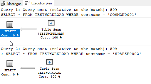
SELECT * FROM TESTWORKLOAD WHERE testname = 'COMMON0001';
SELECT * FROM TESTWORKLOAD WHERE testname = 'SPARSE0002';
Select both of them and, in management studio, press Control+L or the “Display estimated execution plan” button. What you will see is this:
What you see here is that both queries will do a full table scan. That means that the database will go and grab every single row from the table, look at the rows one by one, and give us only the ones who match (the ones with COMMON0001 or SPARSE0002, respectively).
That’s ok when you don’t have a lot of rows (say, up to 5 or 10 thousand), but it’s terribly slow when you have a lot (like our 2 million).
So let’s create an index for that:
CREATE NONCLUSTERED INDEX [IX_testname] ON [dbo].[TESTWORKLOAD]
(
	[testname] ASC
)
GO
And here’s where you watch the magic happen. Select the same queries as above and press Control+L (or the “Display estimated execution plan” button) again. Voila:
What you see here is that, even though the only difference between the two queries is the filter value, the execution plan changes.
Why does this happen? And how?
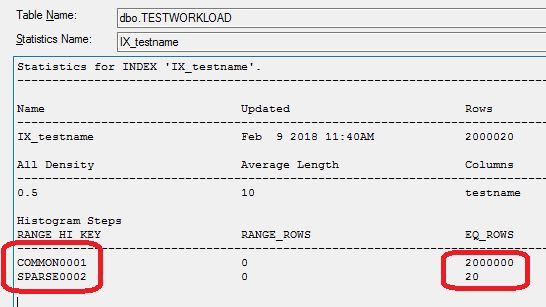
Well, here’s where statistics are handy. On the Object Explorer of management studio, expand (the “+”) our database and table, and then the “Statistics” folder.
You can see the statistic for our index, IX_testname. If you open it (double click and then go to “details”) you see the following:
So (I’m simplifying a bit here, but not a lot) the database knows how many rows have the value “COMMON0001” (2 million) and how many the value “SPARSE0002” (just 20).
Knowing this, it concludes (that’s the job of the query optimizer) that the best way to execute the 2 queries is different:
The first one (WHERE testname = ‘COMMON0001’) will return almost all the rows of the table. Knowing this, the optimizer decides that it’s faster to just get everything (aka Full Table Scan) and filter out the very few rows we don’t need.
For the second one (WHERE testname = ‘SPARSE0002’), things are different. The optimizer knows that it’s looking only for a few rows, and it’s smartly using the index to find them as fast as possible.
In plain English, if you want the hay out of a haystack, you just get the whole stack. But if you’re looking for the needles, you go find them one by one.
Coders used in C#, Java etc. know there are two ways to evaluate a logical AND. In C# you can do either
if (test1) & (test2)
{
  // whatever
}
or
if (test1) && (test2)
{
  // whatever
}
The difference, of course, is that in the first case (&) BOTH test1 and test2 are evaluated. This doesn’t matter much if test1 and test2 are variables, but it matters a lot if they’re methods. This of the following example:
if (reserveItemsForOrder()) && (sendOrderToErp())
{
  // whatever
}
In this fictional case, && means that the order will be sent to the ERP system only if items can be reserved. If the single & is used, however, it will be sent anyway –even if not enough stock can be found.
This is well known in languages like C, C++, C#, Java etc. But how is AND evaluated in Oracle?
In short, it’s the same as &&.But for a more complete explanation, let’s read it from Oracle itself:
Short-Circuit Evaluation
When evaluating a logical expression, PL/SQL uses short-circuit evaluation. That is, PL/SQL stops evaluating the expression as soon as the result can be determined. This lets you write expressions that might otherwise cause an error. Consider the following OR expression:
DECLARE
…
on_hand INTEGER;
on_order INTEGER;
BEGIN
..
IF (on_hand = 0) OR ((on_order / on_hand) < 5) THEN
…
END IF;
END;
When the value of on_hand is zero, the left operand yields TRUE, so PL/SQL need not evaluate the right operand. If PL/SQL were to evaluate both operands before applying the OR operator, the right operand would cause a division by zero error. In any case, it is a poor programming practice to rely on short-circuit evaluation.
As part of an investigation project at work, we had to create a number of graphs. Of course our first idea was using Excel; but it turns out that in a lot of scenarios it’s ambiguous, time consuming and sometimes outright frustrating. So we ended up doing it with Gnuplot, which provided a much better experience.
This article is not meant to give extended coverage of course; there are many FAQs and other documents available online for that (a small collection is given at the end of the article). It’s meant to cover basic usage and some common scenarios, namely:
How to download and install
How to plot a simple function
How to plot data points from a file
How to plot multiple functions and/or data points
How to setup the plot (axes etc.)
How to fill the area between functions
How to export the plot for MS Office
How to plot using batch files
Links and FAQs
Gnuplot is a really powerful tool. This article won’t cover many things, like 3D plots, polar coordinates, binary data, financial-style graphs and others; take a look at the demo library for that (link given at the end).
How to download and install
Download is provided from Sourcefourge. Go to http://www.gnuplot.info/download.html and get the current version. After downloading, installation is pretty easy and straightforward. Just click “next” in every step and you’ll be ok.
After installation, start Gnuplot from the desktop icon. You’ll get a command prompt (gnuplot>).
How to plot a simple function
A major problem with MS Excel is that you cannot create a graph for a function; you have to create the data in cells, using a formula. And of course, the values will not be continuous but discrete.
So let’s say you want to make a graph of a function f(x)=x^2+10/x, for values of x between -10 and 10. Enter these commands to the command prompt, pressing ENTER after each line (lines that begin with # are comments):
# setup the x axis range
set xrange [-10:10]
# plot our function
f(x)=x**2+10/x
plot f(x)
To change the line color, the easiest way is to use one of the available linestyles:
plot f(x) linestyle 3
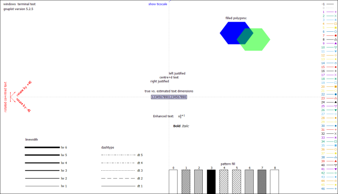
In order to see the readily available linestyles, just enter:
test
How to plot data points from a file
For our example, we have two text tab-separated files, c:\temp\out1.txt and c:\temp\out2.txt, that look like this:
The first has just two columns, x and y. The second has four columns: the second is labels on x, the third and fourth are measurement values (y) and the first an incremental number (for gnuplot to know which comes first, second etc.)
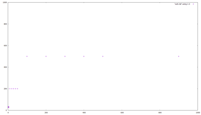
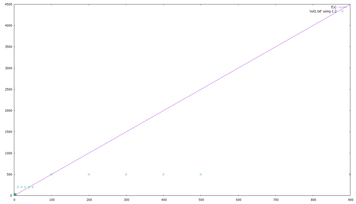
Let’s plot the first one:
# make sure we're in the correct dir
cd 'c:\temp\gnuplot'
set xrange [0:1000]
set yrange [0:1000]
plot 'out1.txt' using 1:2
Note the 1:2 here. This tells gnuplot that the 1st column of the file will be used for x and the 2nd for y.
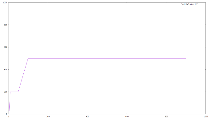
If you want to connect the points, the last line would be:
plot 'out1.txt' using 1:2 with lines
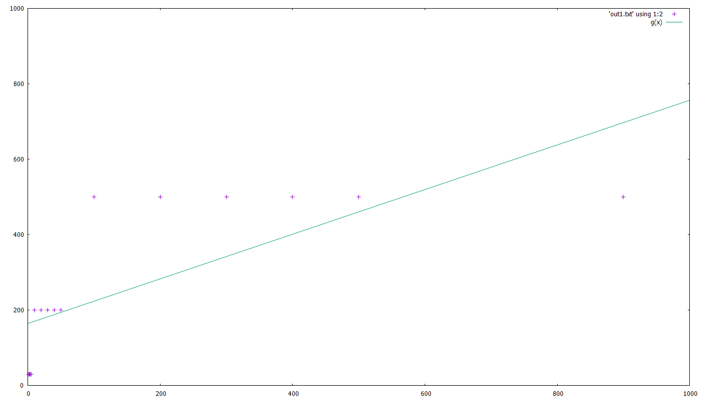
If instead of simply connecting the points you would need to do a ‘best fit’ with a given function, say g(x)=a*x+c :
g(x)=a*x+c
fit g(x) 'out1.txt' using 1:2 via a,c
# here you get a list of the calculations gnuplot is doing, the parameters used and the standard error
plot 'out1.txt' using 1:2, g(x)
Of course, that’s not a very accurate fit, but that’s not our point here 🙂
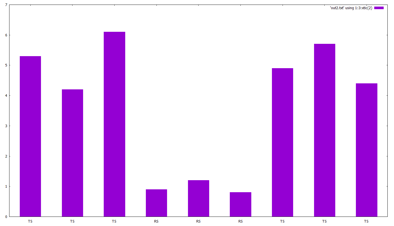
Let’s now plot the second file. Our goal here is to create a bar chart:
cd 'c:\temp\gnuplot'
# 'set autoscale' automatically sets ranges for x,y
set autoscale
set boxwidth 0.5
set style fill solid
plot 'out2.txt' using 1:3:xtic(2) with boxes
Note the 1:3:xtic(2). This tells gnuplot that the 1st column is ot be used for x, the 3rd for y and the 2nd (xtic(2)) for x-axis labels.
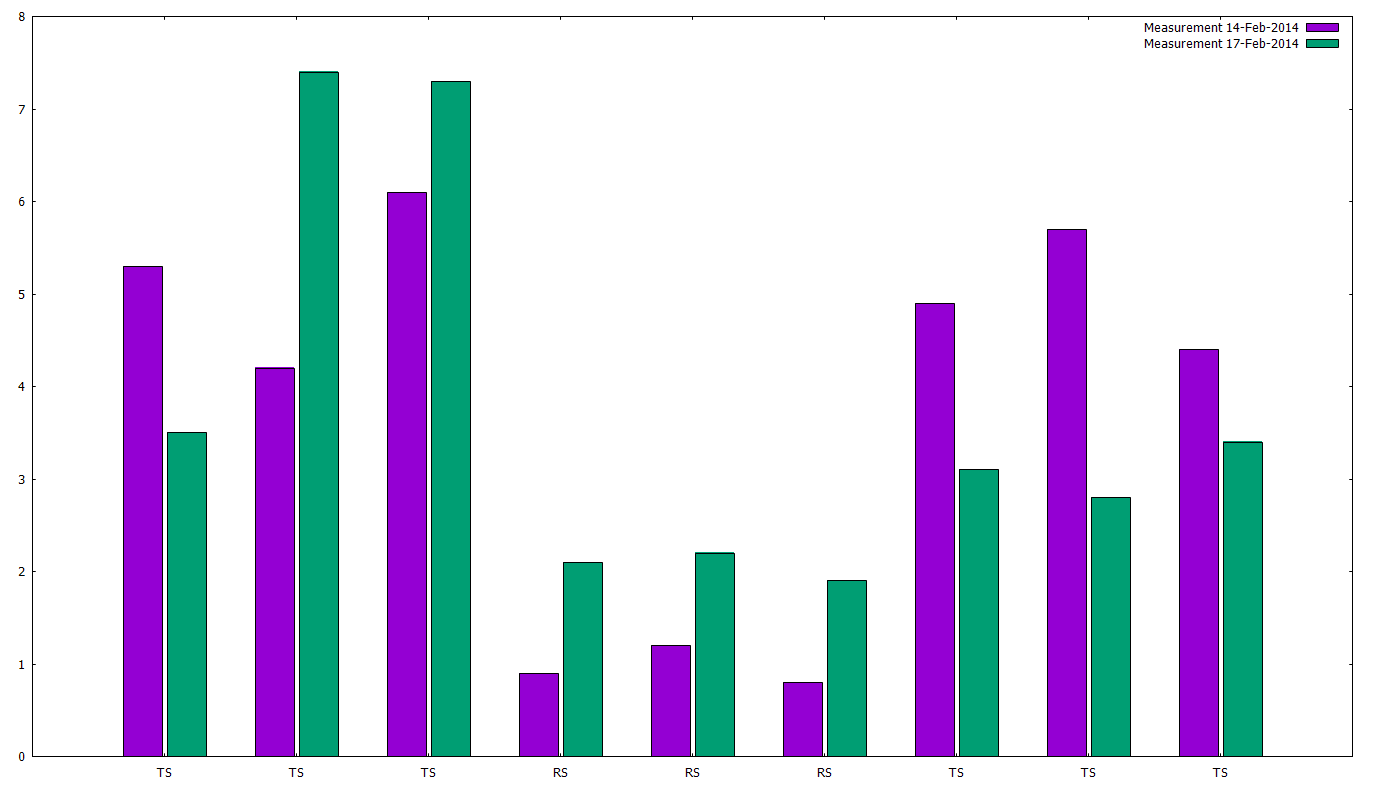
Now let’s try to plot two data series in the same bar chart:
cd 'c:\temp\gnuplot'
set style data histogram
set style histogram cluster gap 1
set style fill solid border -1
set boxwidth 0.9p
plot 'out2.txt' using 3:xtic(2) title 'Measurement 14-Feb-2014', 'out2.txt' using 4:xtic(2) title 'Measurement 17-Feb-2014'
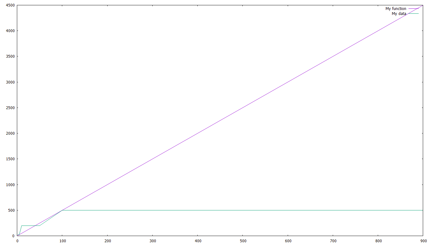
How to plot multiple functions and/or data points
Actually we did that already in the example with the fit and bar examples. We just have to give multiple functions/files and separate them with a comma. As an example:
cd 'c:\temp\gnuplot'
a=5
f(x)=a*x
plot f(x), 'out1.txt' using 1:2
Let’s add a line and a legend, shall we ? The last line will become:
plot f(x) title 'My function', 'out1.txt' using 1:2 with line title 'My data'
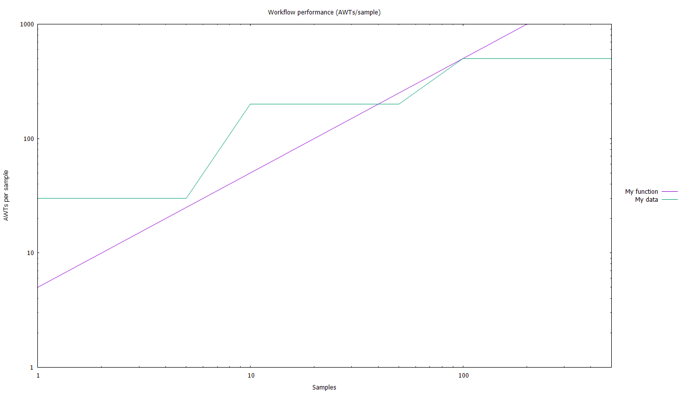
How to setup the plot (axes etc.)
Let’s see an (almost) all-inclusive example:
# Chart title
set title 'Workflow performance (AWTs/sample)'
# Get the legend out of the chart
set key outside
# place the legend
# here you can use 'left', 'right', 'center' and 'top', 'bottom', 'cent'
set key right cent
# Setup the axes range using, e.g.
# From-to
set xrange [1:500]
set yrange [1:1000]
# logarithmic
set logscale x
set logscale y
# axes titles
set xlabel 'Samples'
set ylabel 'AWTs per sample'
# let's see what we've done
replot
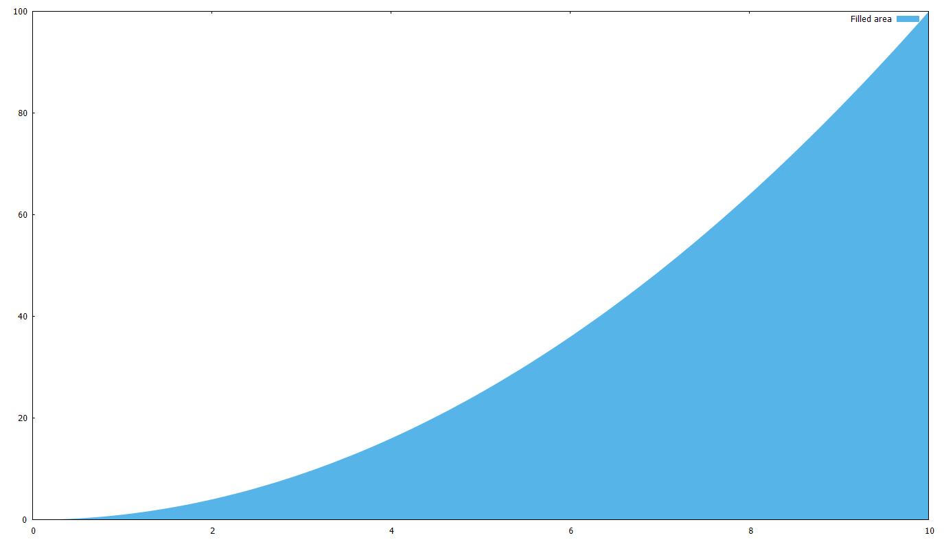
How to fill the area between functions
What if you want to fill the area below a curve, or between two curves ?
First, let’s fill the area between a curve f(x)=x^2 and the x axis:
set xrange [0:10]
# c(x) is the same as the x axis
c(x)=0
f(x)=x**2
# '+' is the pseudofile, you can read about it in the documentation
plot '+' using 1:(c($1)):(f($1)) with filledcurves closed linestyle 3 title 'Filled area'
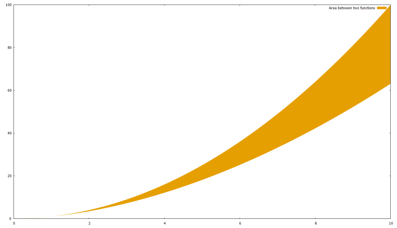
After this, it should be obvious how you can fill the area between two curves; just use a function instead of c(x)=0. Let’s say we use g(x)=x^1.8
set xrange [0:10]
g(x)=x**1.8
f(x)=x**2
plot '+' using 1:(g($1)):(f($1)) with filledcurves closed linestyle 4 title 'Area between two functions'
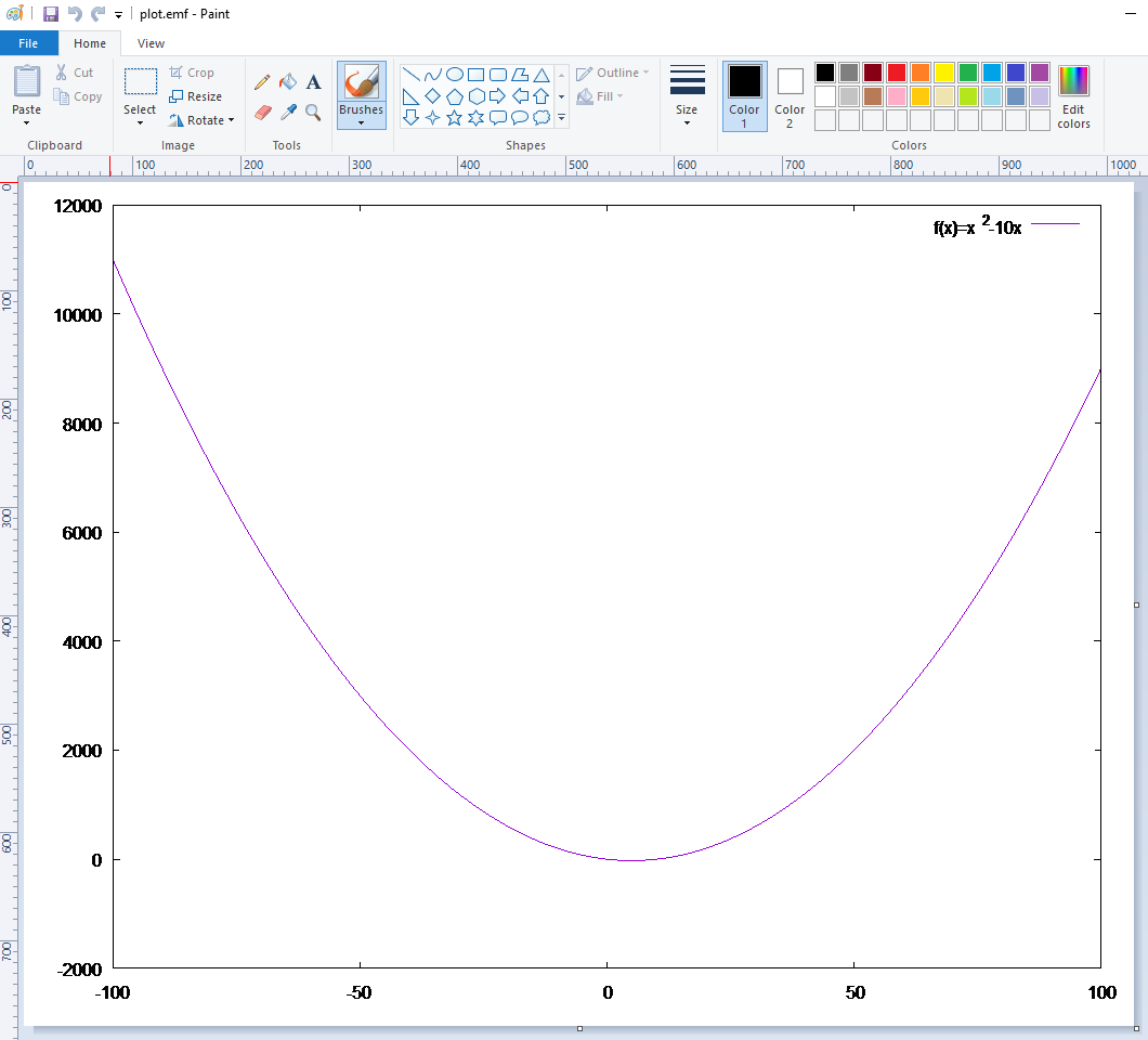
How to export the plot for MS Office
Although of course you can do a printscreen, the best format to use with Word, Powerpoint etc. is the Enhanced Metafile Format (.emf). The best thing about it is that it’s scalable. Surprisingly, if you have a .emf image and preview it (Windows uses Paint by default) it seems awful; but if you insert it in Word it looks great.
So, in order to create a plot and get it as an .emf you need to do something like this:
# output directory and file name
cd 'c:\temp\gnuplot'
set terminal emf enhanced
set output 'plot.emf'
# create the plot
set xrange [-100:100]
f(x)=x**2-10*x
plot f(x) title 'f(x)=x^2-10x'
# because of 'set output' above, plot creates
# the file on disk instead of showing it on the screen
# NOTE: until you 'unset output', the plot file (.emf, .pdf, whatever)
# is locked and cannot be accessed
unset output
# normally you need to return the plot output to the screen
set terminal wxt
How to plot using batch files
Creating a batch file is useful in several scenarios. For example, you might have a data file (like out1.txt above) which changes every day; and every day you need to create the same graph, but with the fresh data.
So in order to do this, just write all gnuplot commands to a text file and execute it with gnuplot.exe. See the example below (the backslash means that the line is continued):
# Save as 'C:\temp\dailychart.plt'
cd 'c:\temp\gnuplot'
set terminal pdf enhanced
set output "plot.pdf"
f(x) = 980/x
c(x) = 650
plot \
f(x) title '980 limit' linestyle 1, \
c(x) title '2 sec limit' linestyle 2, \
'out1.txt' using 1:2 title 'External data' linestyle 3, \
'out2.txt' using 1:3 title 'External data 2' linestyle 4
unset output
quit
The .plt extension is the gnuplot default, but you can name the file anything (e.g. .txt). Now open a Windows command prompt and type: